Graphic Design Process
Noxster SEO Company
To best illustrate the graphic design process we are going to walk you through a real life example of an existing client. Phoenix Challenge coin came to us over a year ago looking for search engine optimization services, as we generated 1st page rankings for 10 plus keywords, our priorities expanded from strictly SEO to SEO and rebranding. Phoenix Challenge Coin was looking to rebrand their company for a new modern look and feel. We decided to document our Graphic Design Process to show you the creative evolution it takes to create a company Logo. For more of our work and to get acquainted with our staff you can check out our graphic design services. We have specialized in logo creation for Corporate Companies, Community Organizations, Fashion, Churches, Entertainment industry, and other products and services. Noxster, a digital marketing firm provides digital solutions for all size companies. Big or small you can expect the same level of creative solutions to your needs.
Phase 1: Fact Finding and Original Logo
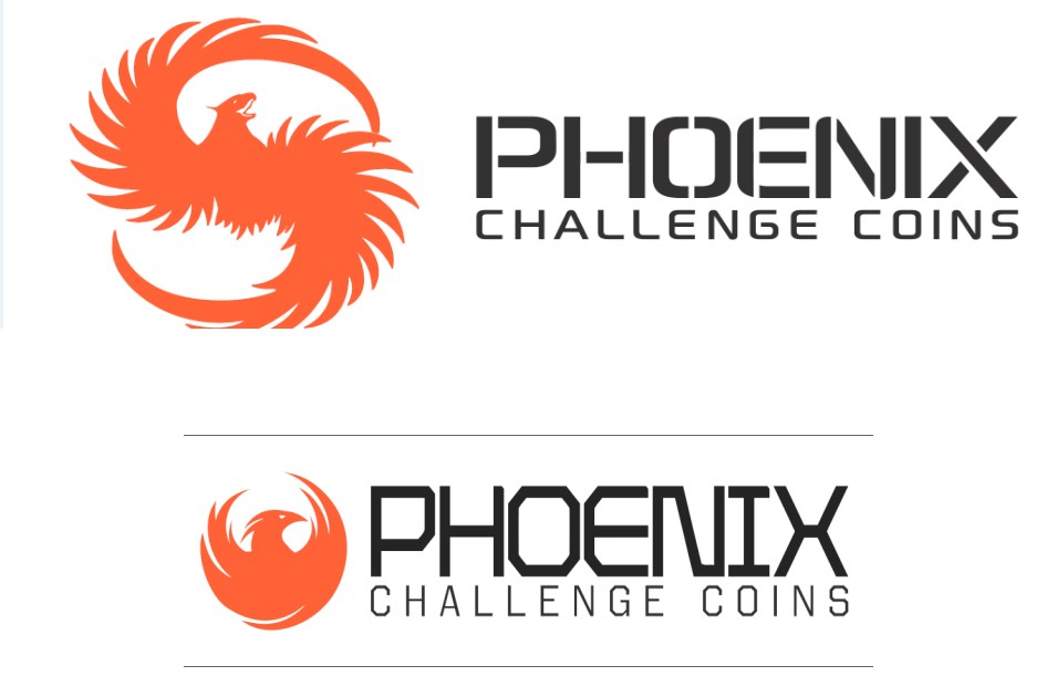
Phoenix Challenge coin works directly with military entities supplying: military coins, poker chips, clothing, and other apparel to all forces. They were looking for a neutral logo that didn’t favor a sector or service to exclude business. They were looking for a big time look that would make a lasting impression. One of the biggest challenges is to create a logo that people will remember. We started with asking relevant questions and finding out why they started their business, target market, product lines, vision, and goals. While they have different service lines we decided to make 1 universal logo that would represent the company. Here is what we started with:
We decided that we loved the use of the orange and it would be the cornerstone for our new logo. A big obstacle is the fact that the Phoenix can’t be trademarked and is currently used across the web. We wanted to make sure it stood out and that orange was used in a classic and simplistic manner. At Noxster when we approach our Graphic Design we want to make sure that the logo that we create would be appealing not only in color but if it was also created in black and white.

Phase 2: Round of Samples

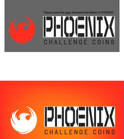
Phase 3: Second Round of Samples
After positive feedback we had enough information to evolve the Logo into the final creation which was approved.

Phase 4: Final Logo
The biggest difference is the shades of orange within the Phoenix. We wanted the Phoenix to have a hint of light yellow to help the orange stand out a little bit more. It was a tough decision to decide which logo they loved the best, but after a ton of deliberation they were able to come to a conclusion.

Phase 5: Style Guide and Final Logo
Upon completion we will deliver you with a Style Guide with all the information that you will need. Here is the final logo and graphic design that Phoenix Challenge Coin decided on. Below is what a typical style guide will look like upon delivery. Included in the style guide are typography, primary color palette, secondary color palette, minimum size, minimum area, and much more. Let us know your thoughts on which Logo you liked the best. If you are looking for any digital services remember that we are much more than a traditional SEO Company Los Angeles. Give us a call today if you are interested in getting a graphic design quote.

